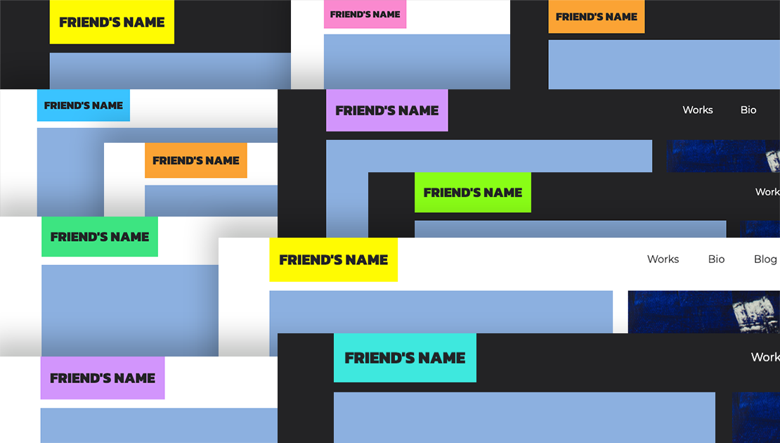
Getting Started
Thanks for giving this template a chance, this is how everything is organized:
    📁 toucan
    |
    |
    └── ─→ 📁 css (folder with all the CSS files needed for this template)
    |       |
    |       ├──  ─→ 📄 blue.css (alternative color)
    |       |
    |       ├──  ─→ 📄 mint.css (this is the default css stylesheet which, among other things, declares the highlight color)
    |       |
    |       ├──  ─→ 📄 neon-green.css (alternative color)
    |       |
    |       ├──  ─→ 📄  orange.css (alternative color)
    |       |
    |       ├──  ─→ 📄  pink.css (alternative color)
    |       |
    |       ├──  ─→ 📄  purple.css (alternative color)
    |       |
    |       ├──  ─→ 📄  turquoise.css (alternative color)
    |       |
    |       ├──  ─→ 📄  yellow.css (alternative color)
    |       |
    |       ├── ─→ 📄  spacing.css (custome paddding and marging)
    |       |
    |       └── ─→ 📄  typography.css (declarations for selectors like h1, h2, h3, p, a, etc.)
    |
    |
    ├── ─→ 📁 img [ folder for images ]
    |       |
    |       ├─  ─→ 📄  icons (hamburger icon, left arrow, right arrow, and preview image)
    |       |
    |       └── ─→ 📄  shop (images for shop page)
    |       |
    |       └── ─→ 📄  works (images for work pages)
    |
    ├── ─→ 📁 js (folder JavaScript file for smooth scrolling)
    |
    |
    ├── ─→ 📁 Vendor (folder with compiled files of Bootstrap and jquery)
    |
    |   ↓↓↓↓ These are the only files you need to worry about ↓↓↓↓
    |
    ├── ─→ 📄 blog.html
    ├── ─→ 📄 index.html
    ├── ─→ 📄 post.html
    ├── ─→ 📄 shop.html
    ├── ─→ 📄 tabs.html
    ├── ─→ 📄 work-1.html
    └── ─→ 📄 work-2.html
Colors
This template comes with 8 different color choices. You may have noticed that the stylesheet "mint.css" is declaring the highlight color.
To change that highlight color to any of the other alternative colors go to line 18, on all of your html pages, and change the stylesheet for mint (mint.css) to any of the other stylesheets in the folder named "css." That line of code will look like this:
<link href="css/mint.css" rel="stylesheet">
For example, if you want to change it to the color yellow, it should look like this:
<link href="css/yellow.css" rel="stylesheet">
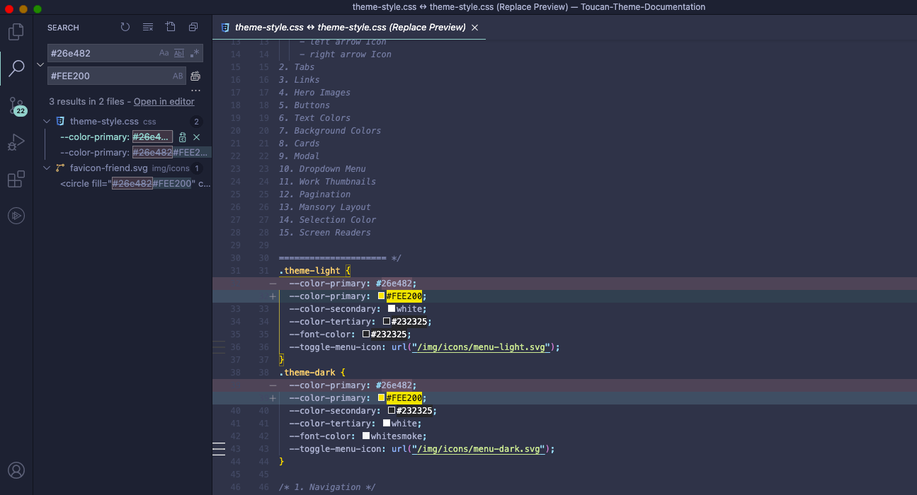
Now, if none of those float your boat; changing the highlight color to any other color is pretty simple. Just follow these two steps:
1. go to the mint.css file (or the stylesheet you are using currently to set your highlight
color) and find the hex number
of the highlight color in lines 33 and 41. In this example, below, the highlight color is
#26E482 (Mint). We will change it to #FEE200 (yellow)
2. This color is mentioned 3 times, if we count the hex number in the favicon. Doing a
search-and-replace
change would be the fastes way. Here is an example using Visual Studio Code:
Text on Navbar
(Optional) change the color of the text sitting over the highlight color on the navbar, for example in the case of this page, it would be the word "Documentation" in your case it should say "Toucan"
-
Go to the tag
<nav></nav>on the top of your html pages -
If you want that text to be white, change the class
text-navtotext-white. This is where that is locate:<!-- Navigation --> <nav class="navbar navbar-expand-lg navbar-light bg-color fixed-top" id="mainNav"> <div class="container"> <a class="navbar-brand js-scroll-trigger highlight-color" href="#page-top"> <h2 class="p-3 mb-0 text-uppercase text-nav">Documentation</h2> ... </nav>
-
If you want that text to be of a color other than white, go to the
mint.cssfile (or the stylesheet you are using currently to set your highlight color) and find in line 53 the class.tex-nav, change there the color to any hex color you want.
Google Fonts
Fonts are fun and fortunately they are easy to implement. I am using Goolge fonts, check what they got here.
1. Copy the font family or font families' links into the
<head>
of your html pages. For example, the fonts I am using in this page are Mono Space for
titles and Montserrat for paragraphs. The links look like this:
<link href="https://fonts.googleapis.com/css2?family=Space+Mono&display=swap" rel="stylesheet">
<link href="https://fonts.googleapis.com/css2?family=Montserrat&display=swap" rel="stylesheet">
2. Go to the typography.css file and change the
font attributes on the declaration: body, p, li, a, h1, h2, and h3 with the font you
linked. Again, that search-and-replace feature can help. The code will look something like
this:
h1 {
    font-family: "Space Mono", monospace;
    }

p {
    font-family: "Montserrat", sans-serif;
    }
Components
These are all the components that come with this template
Navbar:

    <!-- Navigation -->
        <nav class="navbar navbar-expand-lg navbar-light bg-color fixed-top" id="mainNav">
          <div class="container">
            <a class="navbar-brand js-scroll-trigger highlight-color" href="#page-top">
              <h2 class="p-3 mb-0 text-uppercase text-nav">Toucan</h2>
            </a>
            <button class="navbar-toggler" type="button" data-toggle="collapse" data-target="#navbarResponsive"
              aria-controls="navbarResponsive" aria-expanded="false" aria-label="Toggle navigation">
              <span class="navbar-toggler-icon"></span>
            </button>
            <div class="collapse navbar-collapse" id="navbarResponsive">
              <ul class="navbar-nav ml-auto">
                <li class="nav-item padding_30_left">
                  <a class="nav-link js-scroll-trigger" href="#works">
                    Works
                  </a>
                </li>
                <li class="nav-item  padding_30_left">
                  <a class="nav-link js-scroll-trigger" href="#bio">
                    Bio
                  </a>
                </li>
                <li class="nav-item  padding_30_left">
                  <a class="nav-link js-scroll-trigger" href="blog.html">
                    Blog
                  </a>
                </li>
                <li class="nav-item padding_30_left">
                  <a class="nav-link js-scroll-trigger" href="shop.html">
                    Shop
                  </a>
                </li>
                <li class="nav-item padding_30_left">
                  <a class="nav-link js-scroll-trigger no-padding-right" onclick="toggleTheme()">
                  ◐
                  </a>
                </li>
              </ul>
            </div>
          </div>
        </nav>
    <!-- Navigation -->
Primary Button:
    <a href="#" target="_blank">
         <button class="primary-btn">Buy Now</button>
    </a>
Secondary Button:
    <a href="#" target="_blank">
        <button class="secondary-btn">Buy Now</button>
    </a>
Tertiary Button:
    <a href="#" target="_blank">
        <button class="tertiary-btn">Buy Now</button>
    </a>
Pagination:
    <!--- pagination -->
        <div class="container padbot_60 padtop_60">
            <div class="row">
                <div class="col d-flex justify-content-end">
                    <nav aria-label="Pagination" class="dark">
                        <ul class="pagination">
                            <li class=" page-item disabled"><a class="page-link" href="#" tabindex="-1">Previous</a></li>
                            <li class="page-item active"><a class="page-link" href="#">1</a></li>
                            <li class="page-item"><a class="page-link" href="#">2</a></li>
                            <li class="page-item"><a class="page-link" href="#">3</a></li>
                            <li class="page-item"><a class="page-link" href="#">Next</a></li>
                        </ul>
                    </nav>
                </div>
            </div>
        </div>
    <!--- pagination -->
Card -with carousel- for shop page:
    <!-- Card -with carousel- for shop -->
        <div class="col-12 col-lg-6 px-0">
            <div class="" data-aos="fade-up" data-aos-delay="400">
                <div class="card-no-hover">
                    <div id="item-1" class="carousel slide" data-ride="carousel" data-interval="false">
                        <div class="carousel-inner">
                            <div class="carousel-item active">
                                <img class="d-block w-100 "
                                    src="https://via.placeholder.com/540/505050/FFFFFF/?text=1_Img_540x540"
                                    alt="First slide">
                            </div>
                            <div class="carousel-item">
                                <img class="d-block w-100 "
                                    src="https://via.placeholder.com/540/505050/FFFFFF/?text=2_Img_540x540"
                                    alt="Second slide">
                            </div>
                            <div class="carousel-item">
                                <img class="d-block w-100 "
                                    src="https://via.placeholder.com/540/505050/FFFFFF/?text=3_Img_540x540"
                                    alt="Third slide">
                            </div>
                        </div>
                        <a class="carousel-control-prev" href="#item-1" role="button" data-slide="prev">
                            <span class="carousel-control-prev-icon" aria-hidden="true"></span>
                            <span class="sr-only">Previous</span>
                        </a>
                        <a class="carousel-control-next" href="#item-1" role="button" data-slide="next">
                            <span class="carousel-control-next-icon" aria-hidden="true"></span>
                            <span class="sr-only">Next</span>
                        </a>
                    </div>
                    <div class="card-body">
                        <h3 class="text-color-x">Hat with teeth</h3>
                        <div class="product_price">
                            <span class="price text-color-x">$45.00</span>
                        </div>
                        <p class="text-color-x">Hand-painted with acrylic..</p>
                        <a href="#" target="_blank">
                            <button class="primary-btn-exception">Buy Now
                            </button>
                        </a>
                    </div>
                </div>
            </div>
        </div>
    <!-- Card -with carousel- for shop -->
Blog Post Preview:
Post Sample
Lorem ipsum dolor sit amet, consectetur adipisicing elit. Reiciendis aliquid atque, nulla? Quos cum ex quis soluta, a laboriosam. Dicta expedita corporis animi vero voluptate voluptatibus possimus, veniam magni...
Posted on January 1, 2017
<!-- Blog Post Preview -->
<div class="card mb-4">
<div class="card-body">
<div class="row">
<div class="col-lg-6">
<a href="#">
<img class="img-fluid pb-3"
src="https://via.placeholder.com/750x300/505050/FFFFFF/?text=750x300"
alt="">
</a>
</div>
<div class="col-lg-6">
<a href="#" target="_blank" class="text-color-x">
<h2 class="text-color-x no-underline">Post Sample</h2>
</a>
<p class="text-color-x">Lorem ipsum dolor sit amet, consectetur adipisicing
elit.
Reiciendis
aliquid atque, nulla? Quos cum ex quis soluta, a laboriosam. Dicta expedita
corporis
animi vero voluptate voluptatibus possimus, veniam magni...</p>
<a href="#" target="_blank">
<button class="primary-btn-exception">Read More →
</button>
</a>
</div>
</div>
<div class="text-muted">
<p class="m-0 text-color-x pt-2">Posted on January 1, 2017</p>
</div>
</div>
</div>
<!-- Blog Post Preview -->
Tabs:
One
Lorem ipsum dolor sit amet, consectetur adipiscing elit, sed do eiusmod tempor incididunt ut labore et dolore magna aliqua. Ullamcorper morbi tincidunt ornare massa eget egestas purus viverra. Sit amet purus gravida quis blandit turpis cursus in hac. Quis commodo odio aenean sed adipiscing diam. Tincidunt tortor aliquam
Two
Lorem ipsum dolor sit amet
Three
Lorem ipsum dolor sit amet
    <!-- Tabs Container-->
        <div class="row padtop_60 padbot_60">
            <!-- Tabs Content -->
            <div class="col-lg-12">
                <ul class="nav nav-pills padtop_15" id="pills-tab" role="tablist">
                    <li class="nav-item" role="presentation">
                        <a class="nav-link active p-3" id="pills-home-tab" data-toggle="pill"
                            href="#pills-tab-one" role="tab" aria-controls="pills-home"
                            aria-selected="true">Tab One</a>
                    </li>
                    <li class="nav-item" role="presentation">
                        <a class="nav-link p-3" id="pills-profile-tab" data-toggle="pill"
                            href="#pills-tab-two" role="tab" aria-controls="pills-profile"
                            aria-selected="false">Tab Two</a>
                    </li>
                    <li class="nav-item" role="presentation">
                        <a class="nav-link p-3" id="pills-contact-tab" data-toggle="pill"
                            href="#pills-tab-three" role="tab" aria-controls="pills-contact"
                            aria-selected="false">Tab Three</a>
                    </li>
                </ul>
            </div>
            <!-- Tabs Content -->
            <!-- Tabs Content -->
            <div class="container p-0">
                <div class="row p-0 pt-3">
                    <div class="col-lg-12 col-sm-12">
                        <div class="tab-content" id="pills-tabContent">
                            <div class="tab-pane fade show active" id="pills-tab-one" role="tabpanel"
                                aria-labelledby="pills-home-tab">
                                <h1 class="text-color padbot_30">One</h1>
                                <p class="text-color">Lorem ipsum dolor sit amet, consectetur adipiscing
                                    elit,
                                    sed do eiusmod tempor incididunt ut labore et dolore magna aliqua.
                                    Ullamcorper morbi
                                    tincidunt ornare massa eget egestas purus viverra. Sit amet purus
                                    gravida quis blandit
                                    turpis cursus in hac. Quis commodo odio aenean sed adipiscing diam.
                                    Tincidunt tortor
                                    aliquam</p>
                            </div>
                            <div class="tab-pane fade" id="pills-tab-two" role="tabpanel"
                                aria-labelledby="pills-profile-tab">
                                <h1 class="text-color padbot_30">Two</h1>
                                <p class="text-color">Lorem ipsum dolor sit amet</p>
                            </div>
                            <div class="tab-pane fade" id="pills-tab-three" role="tabpanel"
                                aria-labelledby="pills-contact-tab">
                                <h1 class="text-color padbot_30">Three</h1>
                                <p class="text-color">Lorem ipsum dolor sit amet</p>
                            </div>
                        </div>
                    </div>
                </div>
            </div>
            <!-- Tabs Content -->
        </div>
        <!-- Tabs Container -->
Masonry Layout Gallery with modal & carousel on click:
    <!-- ======= Masonry Layout Gallery With Modal/Carousel ======= -->
        <div class="container pb-4">
            <!-- Images -->
            <div class="row">
                <div class="col masonry">
                    <div class="item">
                        <a href="#lightbox" data-toggle="modal" data-slide-to="0">
                            <img src="https://via.placeholder.com/543x612/505050/FFFFFF/?text=1_IMG_543x612"
                                class="w-100 pt-4">
                        </a>

                    </div>
                    <div class="itme">
                        <a href="#lightbox" data-toggle="modal" data-slide-to="1">
                            <img src="https://via.placeholder.com/543x543/505050/FFFFFF/?text=2_IMG_543x543"
                                class="w-100 pt-4">
                        </a>

                    </div>
                    <div class="itme">
                        <a href="#lightbox" data-toggle="modal" data-slide-to="2">
                            <img src="https://via.placeholder.com/543x700/505050/FFFFFF/?text=3_IMG_543x700"
                                class="w-100 pt-4">
                        </a>
                    </div>
                    <div class="itme">
                        <a href="#lightbox" data-toggle="modal" data-slide-to="3">
                            <img src="https://via.placeholder.com/543x400/505050/FFFFFF/?text=3_IMG_543x400"
                                class="w-100 pt-4">
                        </a>

                    </div>
                </div>
            </div>
            <!--Images-->
            <!-- Lightbox -->
            <div id="lightbox" class="modal fade" role="dialog">
                <div class="modal-dialog modal-lg modal-dialog-centered" role="document">
                    <div class="modal-content">
                        <div class="modal-body">
                            <div class="carousel slide" data-ride="carousel" data-interval="false"
                                tabindex="-1" id="carousel">
                                <div class="carousel-inner">
                                    <div class="carousel-item active" data-slide-to="0">
                                        <img class="d-block w-100"
                                            src="https://via.placeholder.com/543x612/505050/FFFFFF/?text=1_IMG_543x612">
                                    </div>
                                    <div class="carousel-item" data-slide-to="1">
                                        <img class="d-block w-100"
                                            src="https://via.placeholder.com/543x543/505050/FFFFFF/?text=2_IMG_543x543">
                                    </div>
                                    <div class=" carousel-item" data-slide-to="2">
                                        <img class="d-block w-100"
                                            src="https://via.placeholder.com/543x700/505050/FFFFFF/?text=3_IMG_543x700">
                                    </div>
                                    <div class=" carousel-item" data-slide-to="3">
                                        <img class="d-block w-100"
                                            src="https://via.placeholder.com/543x400/505050/FFFFFF/?text=3_IMG_543x400">
                                    </div>
                                </div>
                                <a class="carousel-control-prev" href="#carousel" role="button"
                                    data-slide="prev">
                                    <span class="carousel-control-prev-icon" aria-hidden="true"></span>
                                </a>
                                <a class="carousel-control-next" href="#carousel" role="button"
                                    data-slide="next">
                                    <span class="carousel-control-next-icon" aria-hidden="true"></span>
                                </a>
                            </div>
                        </div>
                    </div>
                </div>
            </div>
            <!-- Lightbox -->
        </div>
    <!-- ======= Masonry Layout Gallery With Modal/Carousel ======= -->